Nickelodeon Big Base Camp
For this project Nickelodeon UK tasked me with building an entire Brand, Styleguide & Promo Spots for an big event called “Nickelodeon Big Base Camp” that is happening later this year (2019). This was a challenge in and of itself, as the event had nothing to do with camping so the logo or artwork couldn’t reflect that, it also needed to be based on the new Nickelodeon Styleguide but be different enough to stand as its own as a brand. Below is the final Teaser and Styleguide all assets where produced at just other 4k resolution as print ready artwork would need to be created from all the 3D renders further down the line.


Breakdown
Animatic
Logo Design
So the first step in this project was to design the logo the colour palette came from the already established Nickelodeon Brand as this would help to directly tie it back, but the seconday fonts was something I had room to play with. Below you can see the development from initial concepts to the final purple one on the last page.


3D Logo
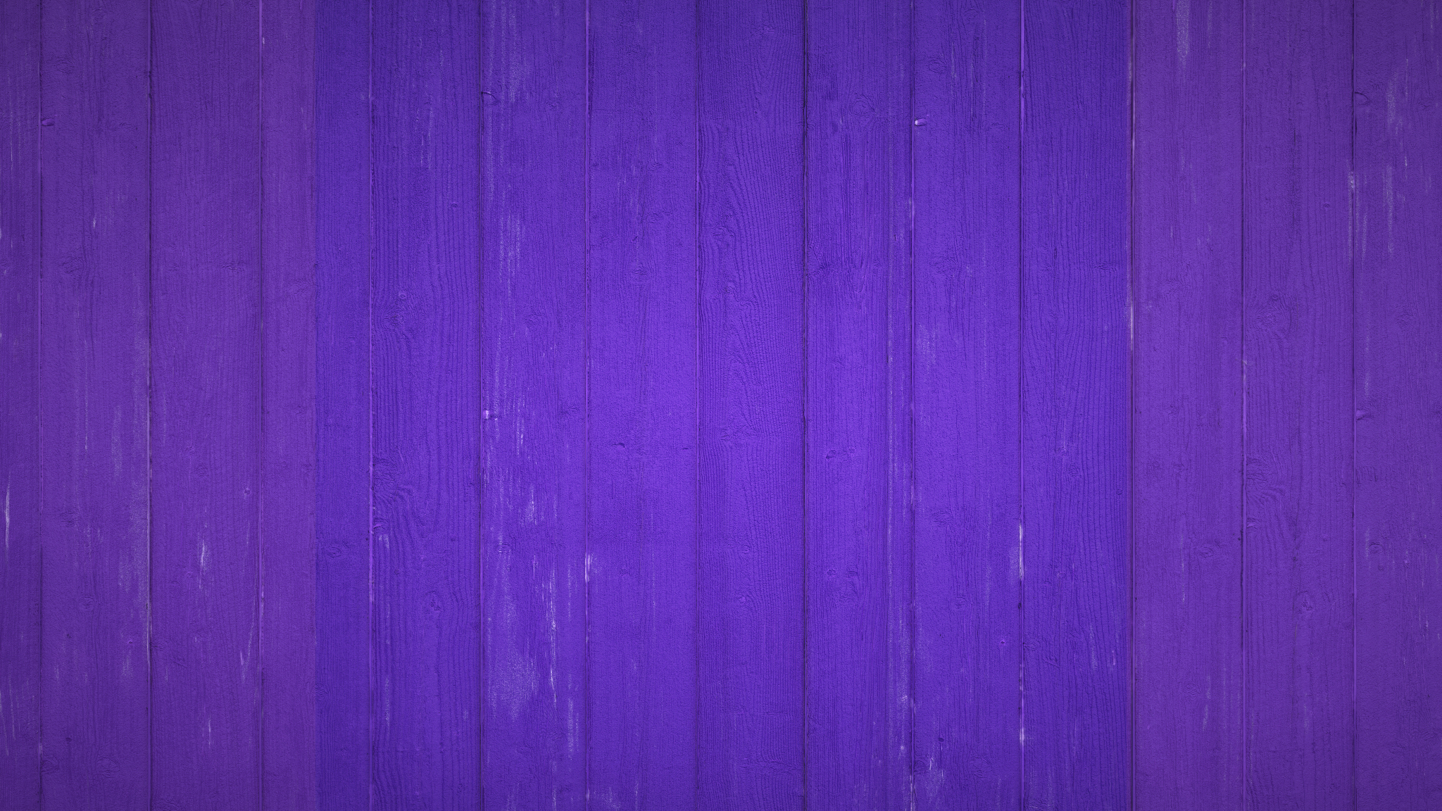
The next step was to bring this in to 3D now we had the final design nailed. The textures used in here would again go on to form the rest of the branding. Below is the development from simple flat shading with a bit of texture, to what ended up as the final at the end with a worn purple wood background, a felt look for the flag and a worn painted metal for the orange.


Backgrounds
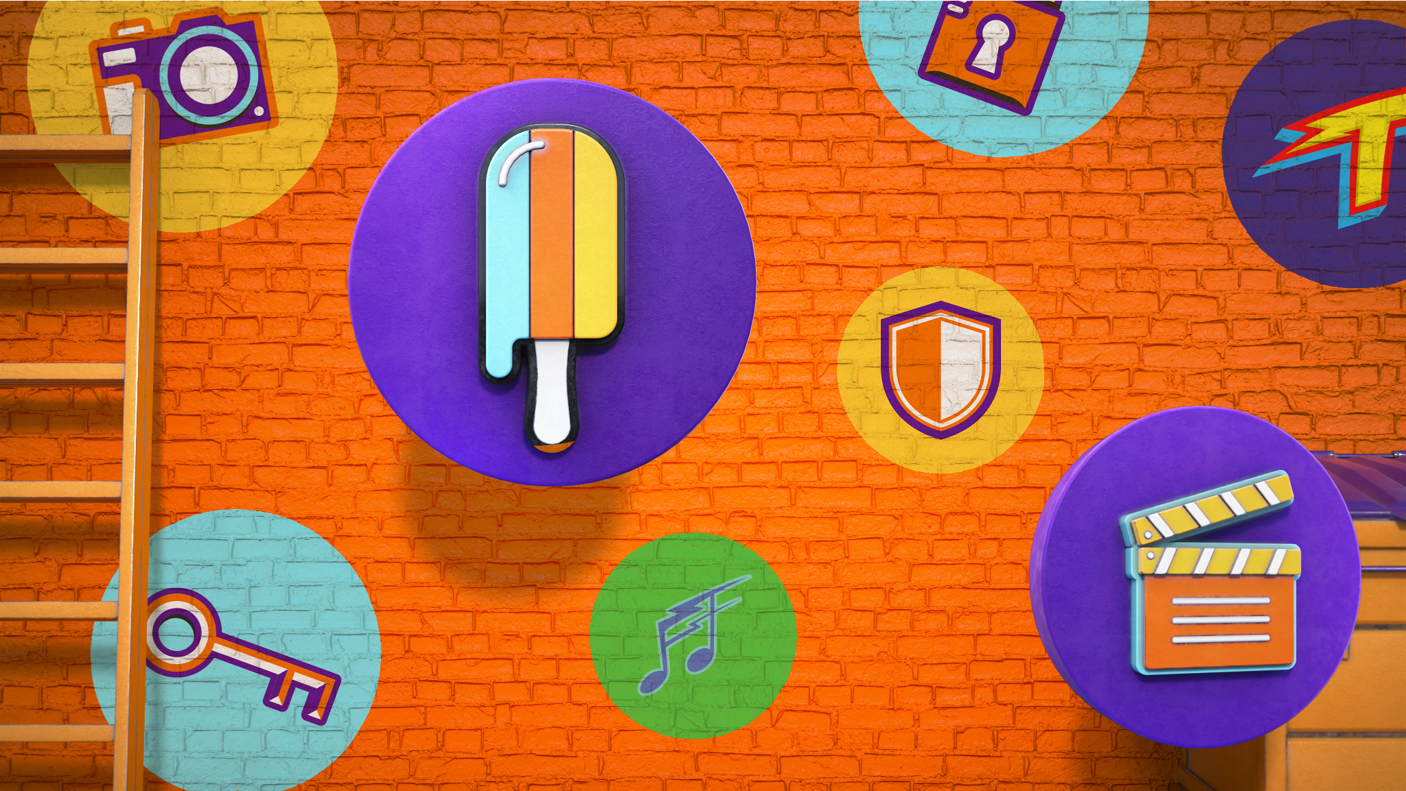
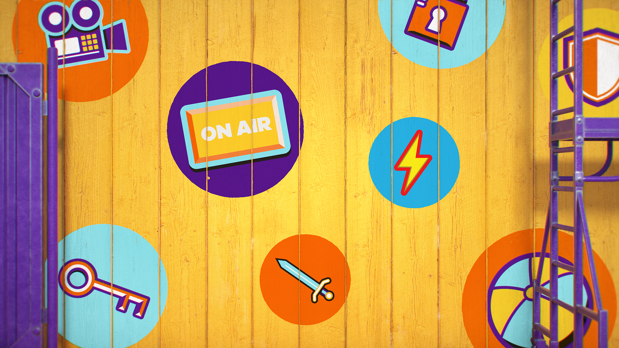
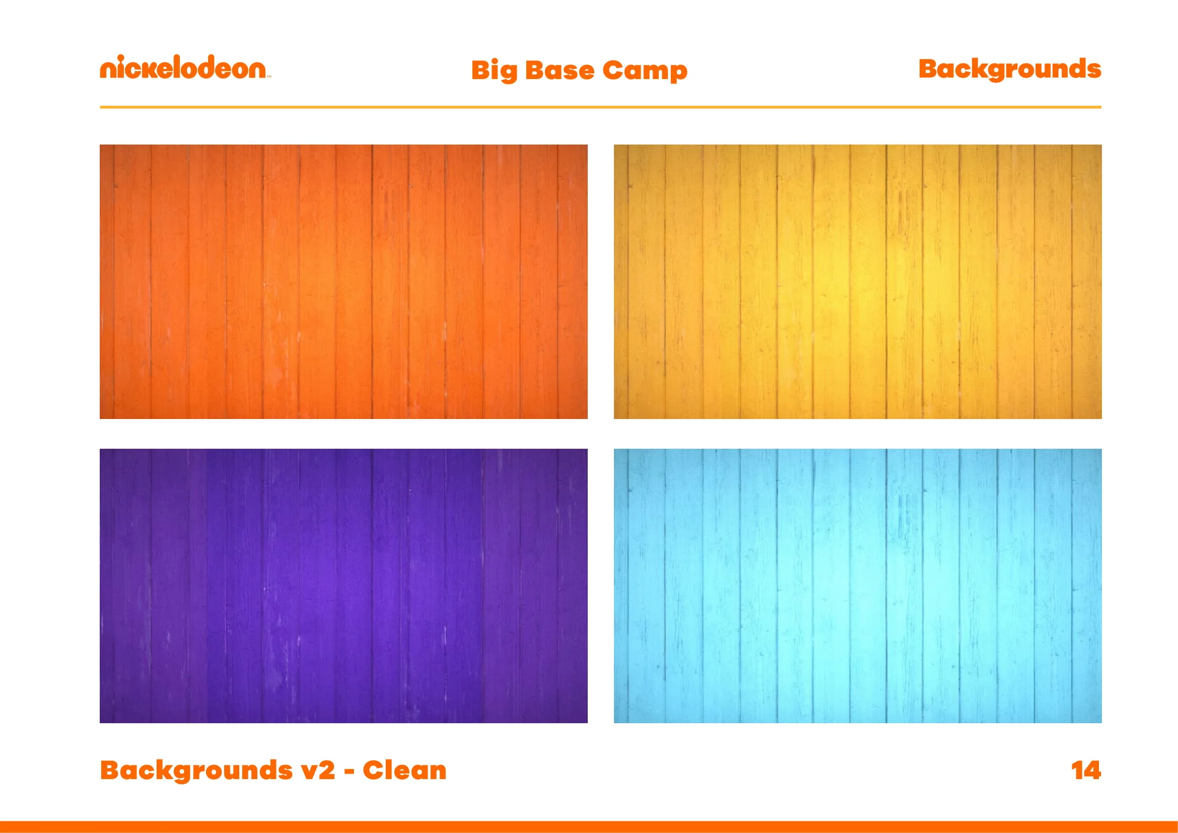
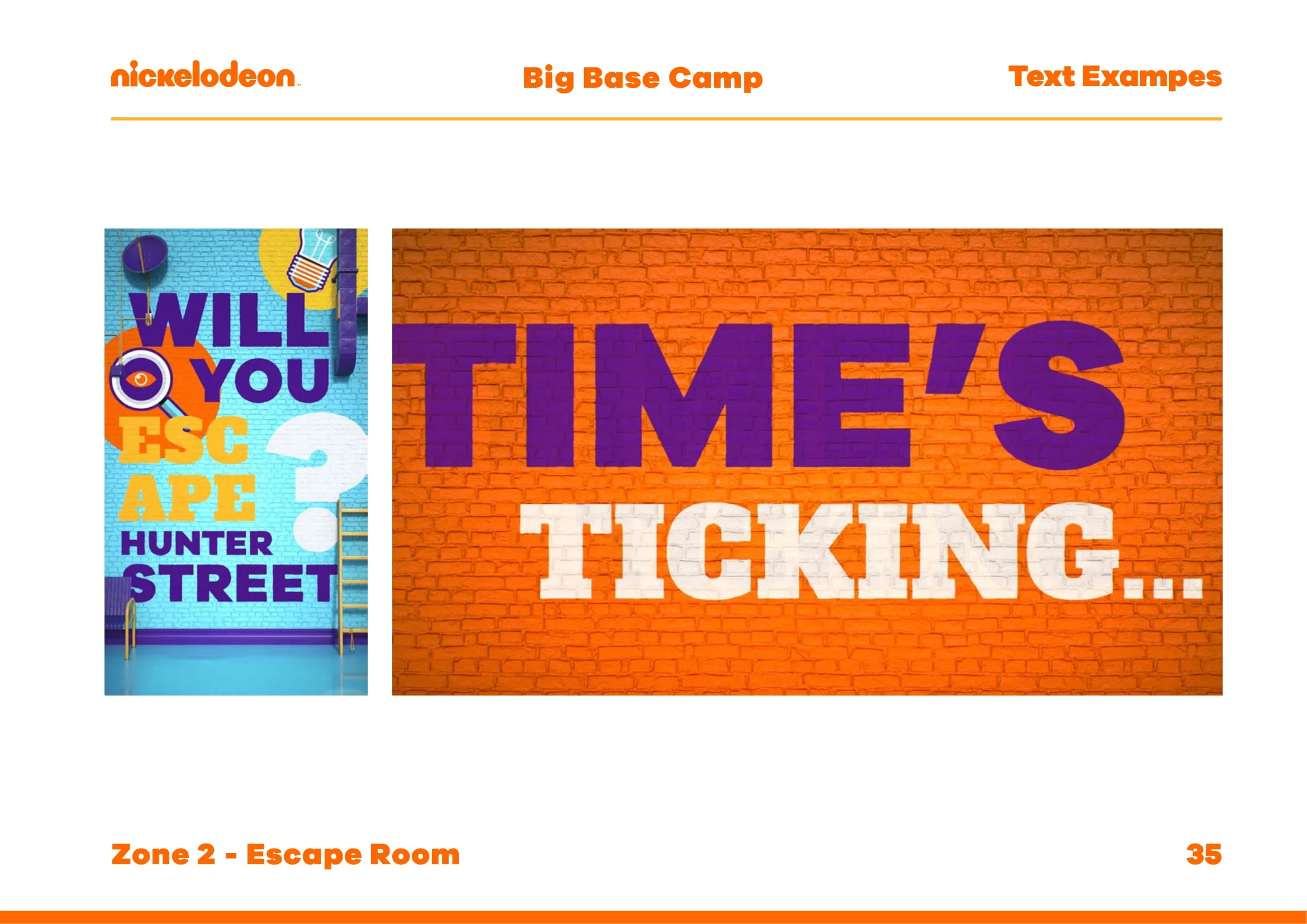
Now we had our final logo established, my focus now turned to building up a libary of assets that would form the rest of the styleguide. This started first with backgrounds, from looking through the current Nickelodeon styleguide there was some streetside images that where never used as part of the on air brand but where still part of the styleguide. Using this as inspiration we purchased some Kitbash3D streetside props and I went about building 3 sets of backgrounds in 4 different core colours. Theses where needed in 16:9 as well as 9:16 for social.
These where built with Cinema4D’s take system to allow maximum flexibily when it came to changes. The main take had all backgrounds and props in, then there was a child take for each of the versions, and within those child takes another set of childen for the 4 different colour ways. There was also takes for the clean versions linking to a different camera closer to the wall, and a matte take with all materials changed to matte black with a plane made visible intersecting the displacement on the wall to allow the wood grooves to be matted out. Below you can find all backgrounds in high resolution.


Portrait


Landscape


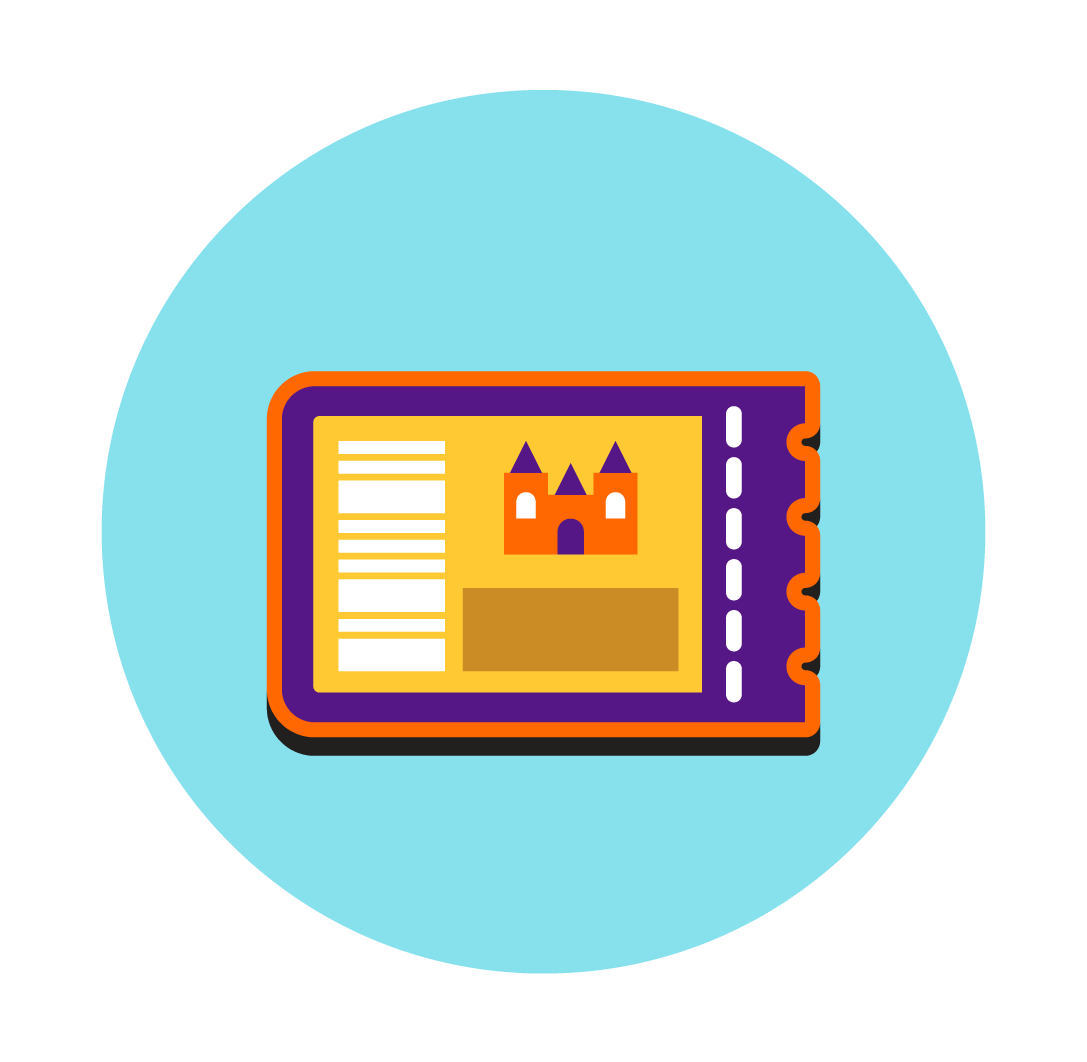
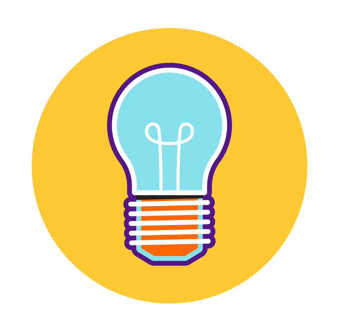
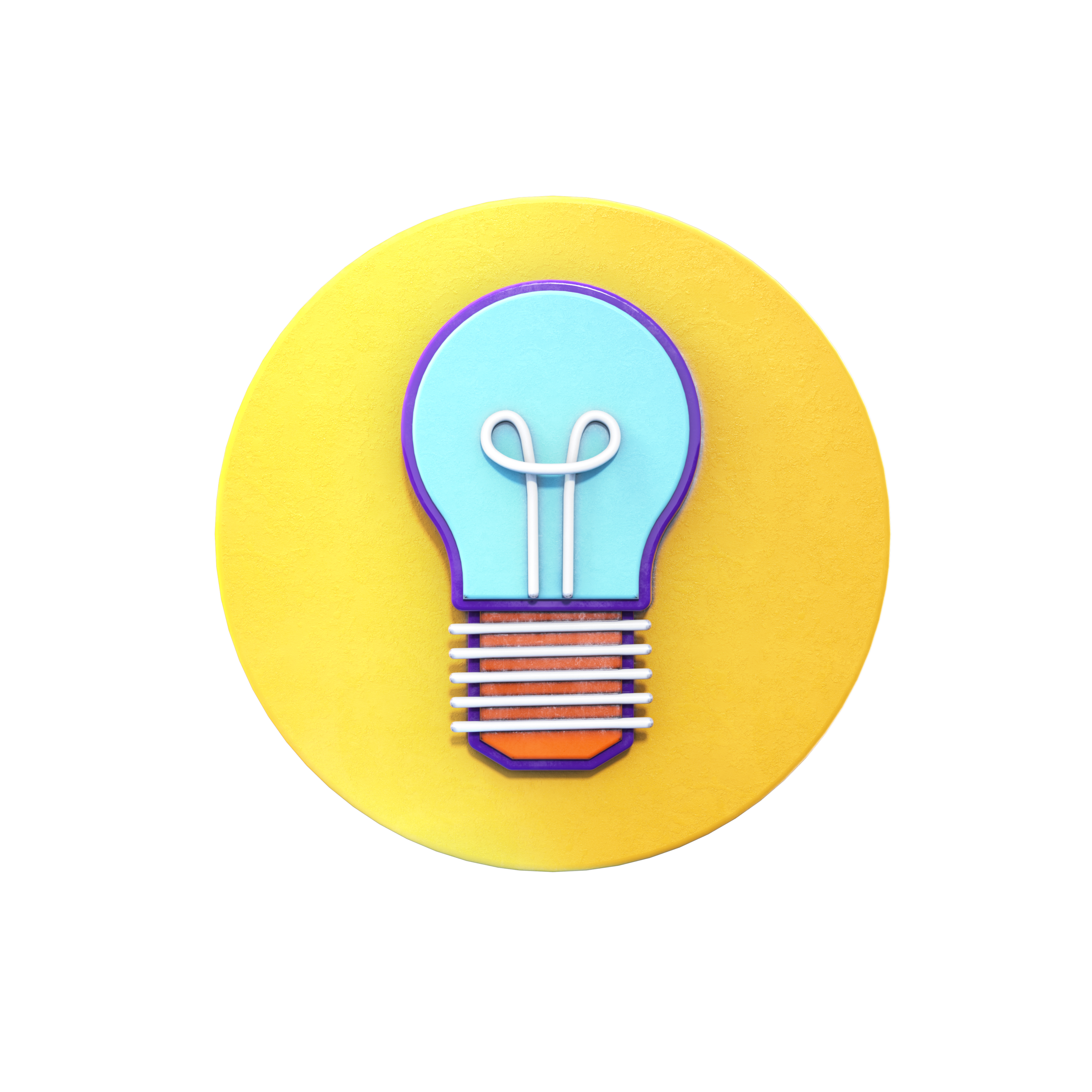
Icons
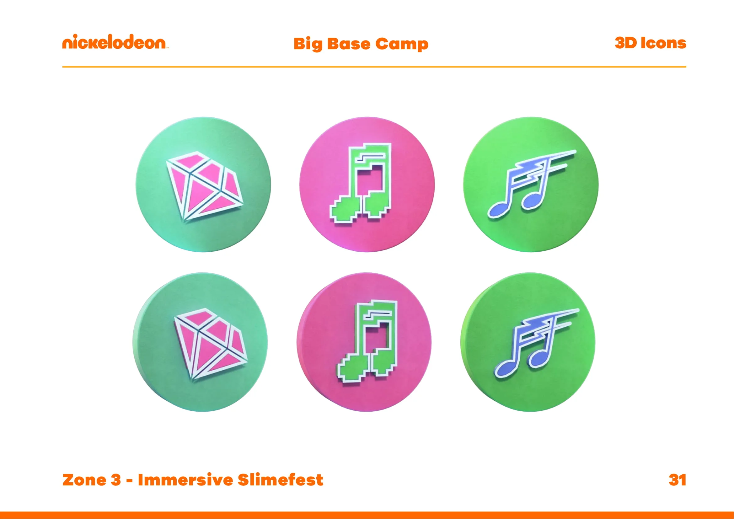
With all the backgrounds and logo designed and rendered. The next step was to move on to designing icons for each of the zones that would be at the event. These once again needed to incorporate the Nickelodeon Colours. They where created in 2D vector format first, which was then transferred over to 3D for Perspective and flat versions to allow as much flexibility as possible when two 3D rendered icons are used together.


Combining Elements
Now I had the backgrounds and 2D & 3D icons, I moved on to combining elements so future designer could see how elements could be used together to create a wide variety of graphics.